Documentation
In the package, you have :
- This manual
- The template for Joomla 1.5 / 2.5 / 3.0
Template Settings
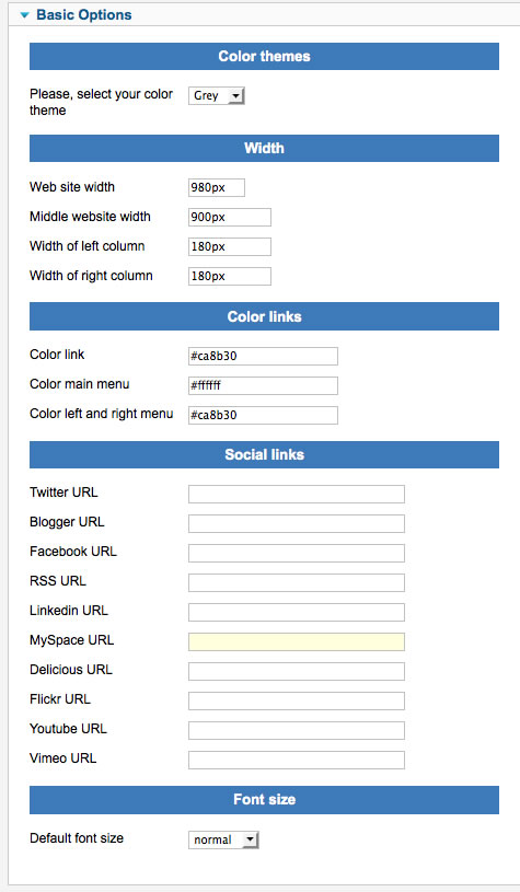
You can access to template manager with the top menu : "Extensions --> Template Manager --> joomspirit_51 "
With "joomspirit_51 template", you can :
- Set the width of your website, for the middle website, the left and right column in px or % (fixed or fluid)
- Choose your color theme : black, grey or white.
- NEW : set the color for items menus and link
- Display or not your social links
- choose the font size

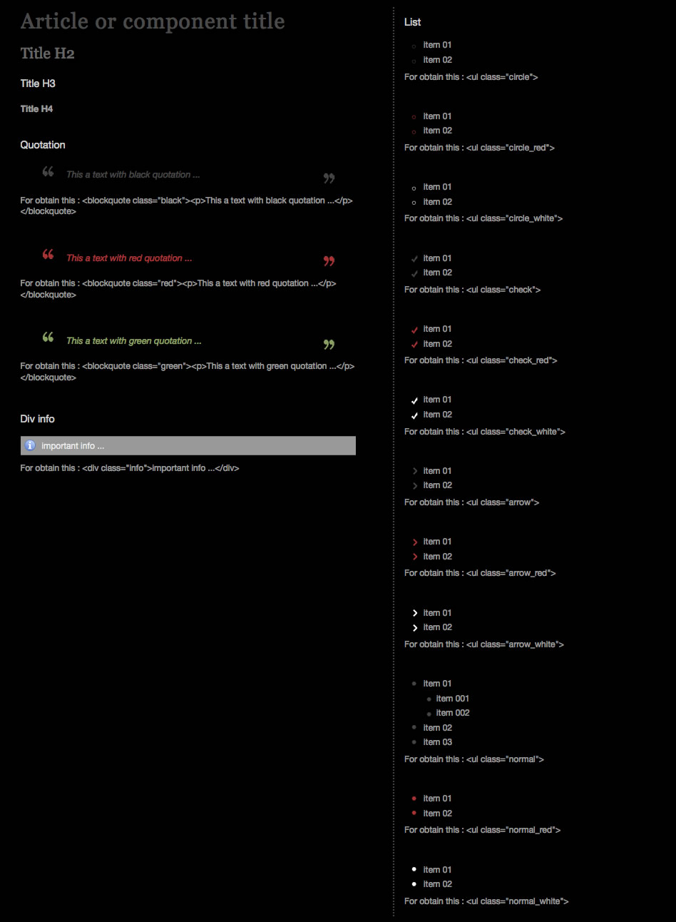
Typography

Module Positions
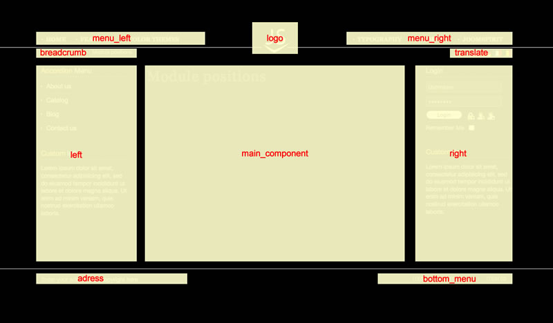
You must publish your modules with the right position :

Example for the "adress" position : go to the module manager and create a new module with the option "custom html". Write your adress or/and copyright and choose the position "adress".
How to display your logo ?
Go to the module manager and create a new module with the option "custom html". Choose the position "logo" and insert your logo inside.
In the "images sources" folder you will find my logo example with a background black, grey and white. This three files are .png transparent without the text "JS" : you can open it in all image software and add your text.
Warning : for a better display, use a .png transparent for your logo
How to configure the main menus ?
In this template, your logo is automatically center. You must create one menu for the left side and another for the right side.
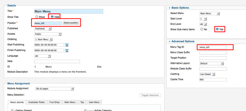
For the left menu :
You must :
- Select the position : "menu_left"
- choose "yes" for always show submenu item
- Enter the menu tag ID : "menu_left"

For the right menu :
You must :
- Select the position : "menu_right"
- choose "yes" for always show submenu item
- Enter the menu tag ID : "menu_right"
Module class suffix for left and right position :
With positions "left" and "right" you are 2 possibilities for display yours modules :
- Without module class suffix : no background image and none style for your list. It's ideal for put just an image or text.
- With the module class suffix " submenu" : you add some CSS style for the list. It's ideal for your menu. I use this setting for the left menu in the demo.
Note : Don't forget the space before the module class suffix
Rendering difference between browsers :
This template works perfectly with Chrome, Firefox, IE6+. But I've use some functionnality of CSS3, almost not supported by IE :
- All textfield and the "read more" button use the property "border-radius" for obtain a rounded corner. OK for all browsers except IE
- For Firefox Chrome and Safari, you can use the class ".shadow" for yours images. You will obtain a nice shadow effect (see examples on this demo).
- The feed, print, mail, pdf have a rotate effect on hover. OK only for Firefox, Chrome, Safari, Opera
I decided to use these functionnality for obtain a clean and light template. With that, there're less code and fewer images to load, with the better of each browser !!